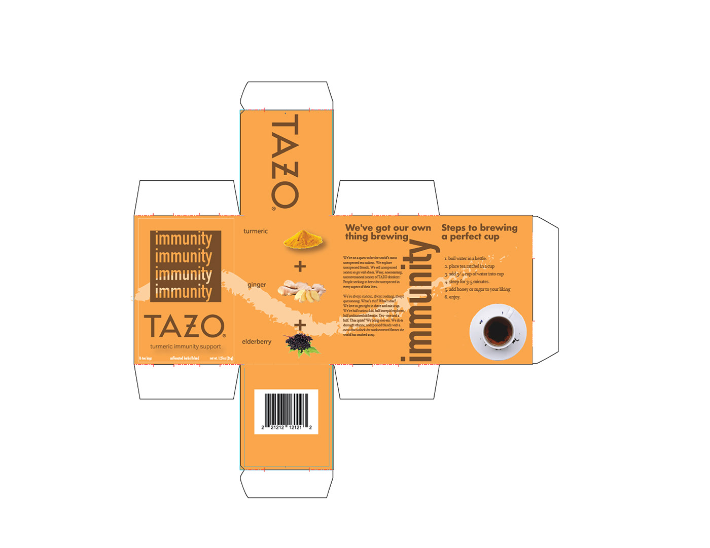
In this series package redesign for the TAZO tea brand, I was first tasked with the role of conducting research in order to gather a better understanding of what the target audience is for this new line of teas. From the gathered results, the overall aesthetic of these new flavors would be an organic, health-conscientious tea line. The three flavors that I chose would promote health and well-being in three vital aspects of one’s daily life. The names of these teas: Refresh, Immunity, and Sweet Dreams.. To exemplify the authenticity yet simplicity of such ingredients, a san serif font is seen paired with a brushstroke-like illustration that flows throughout the entire sides of the box. Layered above the brushstrokes are cutouts of the ingredients that the tea consists of, making it accessible for all consumers to see what they are drinking. Lastly, TAZO’s mission statement is followed by a simple step-by-step process of how to properly brew a good cup of tea.